

Statistical Description of Data — The Complete Picture
This unit teaches the full journey of data: what data mean, how they are collected, how they are arranged and how they are presented through tables, diagrams and graphs.
1. Meaning and Scope of Statistics
Statistics simply means using numbers to understand what is happening.
Imagine a factory produces 10,000 parts every day. It records how many parts were made, how many were rejected, which machine created more defects and which shift performed better. These are just numbers. When we arrange and compare them to find a pattern, we are using Statistics.
Statistics as Numerical Facts
In the plural sense, statistics means numerical facts. Examples are sales figures, population numbers, wages, accident counts, marks and rejection percentages.
A figure must be complete. Saying “production is 500” is not enough. We must know whether it means 500 pieces per day, 500 tonnes per month or 500 orders in a year.
Statistics as a Method
In the singular sense, statistics means the method used to collect, organise, present, analyse and understand data.
It is not only about counting or finding averages. It covers the full process from collecting the right data to drawing a useful conclusion.
2. Applications of Statistics
Statistics is used wherever decisions are made with the help of numbers. It helps people compare, plan, predict and control.
Economics
Statistics is used in demand analysis, index numbers, forecasting, time-series analysis, national income estimation and economic planning.
Business Management
Managers use statistical methods for forecasting, quality control, market research, inventory planning and decision-making under uncertainty.
Commerce and Industry
Past sales, production, wages, costs, competitor data and market trends are analysed to improve planning and profitability.
Government and Public Services
Census, health statistics, unemployment, agriculture, defence and welfare planning depend heavily on reliable data.
3. Limitations of Statistics
Statistics is useful, but it can mislead us if the data are wrong or the sample is biased. It should support judgement, not replace it.
- Statistics studies aggregates. A single isolated observation usually has little statistical meaning.
- Statistics mainly deals with quantitative information. Qualitative characteristics must first be coded or numerically described.
- Conclusions depend on conditions. Forecasts may fail when the underlying conditions change.
- Sampling must be representative. A biased or unrepresentative sample produces misleading conclusions.
- Statistics does not replace judgement. It supports decisions; it cannot compensate for faulty definitions, poor data or wrong interpretation.
4. Data, Variables and Attributes
Before solving a question, first identify what is being studied. If it can be measured in numbers, it is a variable. If it is only a category or description, it is an attribute.
Data
Data are facts or information relating to a characteristic under study. For statistical analysis, even qualitative information may be converted into numerical categories or codes.
Attribute
A quality or category that is described, not measured.
Religion · Nationality · Drinking habitDiscrete Variable
A numerical value obtained by counting separate units.
Accidents · Defects · ChildrenContinuous Variable
A numerical value obtained by measurement.
Height · Age · Income · Profit| Concept | Meaning | Examples | MCQ Clue |
|---|---|---|---|
| Variable | A measurable characteristic | Height, weight, profit, salary | Can take numerical values |
| Discrete Variable | Takes isolated, countable values | Number of accidents, defects, children | Usually counted |
| Continuous Variable | Can take any value within an interval | Height, weight, temperature | Usually measured |
| Attribute | A qualitative characteristic | Gender, nationality, colour | Category, not measurement |
4.1 ICAI Variable Decoder
| Question gives | Think | Reason |
|---|---|---|
| Religion, nationality, drinking habit, gender, colour | Attribute | Qualitative category |
| Number of accidents, defects, children, shares | Discrete variable | Counted in whole numbers |
| Height, weight, age, income, profit, time | Continuous variable | Measured and may take fractional values |
| Marks in a conventional examination question | Discrete variable | Usually recorded in fixed countable marks |
5. Primary Data and Secondary Data
The easiest rule is: Collected by me for my present work = Primary Data. Already collected by someone else = Secondary Data. The same data can be primary for one person and secondary for another.
| Basis | Primary Data | Secondary Data |
|---|---|---|
| Meaning | Collected first-hand for the present purpose | Already collected earlier for another purpose |
| Originality | Original to the investigator | Not original to the present user |
| Cost and Time | Usually higher | Usually lower |
| Suitability | Designed for the present enquiry | Must be checked for relevance and reliability |
| Example | A factory conducts its own employee survey | The factory uses government labour data |
Illustrative MCQ
Professor A records the heights of his students. Professor B later uses the same record to calculate average height. The data are:
(a) Primary for both (b) Secondary for both (c) Primary for A and secondary for B (d) Secondary for A and primary for B
6. Methods of Collecting Primary Data
There is no single best method of collecting data. The correct method depends on the situation.
| Method | How it Works | Main Strength | Main Limitation |
|---|---|---|---|
| Personal Interview | Investigator directly meets respondents | Detailed and relatively accurate | Costly and difficult over a wide area |
| Indirect Interview | Information is obtained from persons connected with the event | Useful where direct contact is impossible | Depends on the informant’s knowledge and neutrality |
| Telephone Interview | Questions are asked over the phone | Quick and economical | Non-response and limited depth |
| Mailed Questionnaire | Questionnaire is sent to respondents for self-completion | Wide geographical coverage | High non-response and misunderstanding |
| Observation | Investigator directly observes or measures | Useful for objective, visible facts | Time-consuming and limited in scope |
| Enumerator Method | Trained enumerators ask questions and fill the schedule | Questions can be explained | Expensive and vulnerable to enumerator bias |
Sources of Secondary Data
- International organisations such as the World Bank, IMF, WHO and ILO.
- Government publications, statistical abstracts and ministry reports.
- Research institutes, universities and quasi-government bodies.
- Private reports, trade associations and unpublished research.
6.1 ICAI Situation-to-Method Table
| Situation in the question | Expected method | Why? |
|---|---|---|
| Quickest collection of primary data | Telephone interview | Immediate contact without travel |
| Widest geographical area | Mailed questionnaire | Can reach distant respondents at low cost |
| Maximum non-response | Mailed questionnaire | Respondents may ignore or not return it |
| Natural calamity where facts can be directly seen | Direct observation | Visible facts can be recorded on the spot |
| Rail accident or sensitive event where direct victims may not be available | Indirect interview | Information is obtained from witnesses or connected persons |
| Exact height, weight or physical condition | Observation / measurement | Objective measurement is more reliable than memory |
7. Scrutiny of Data
Collected data may contain mistakes. Before using it, we must check whether the figures are complete, sensible and internally consistent. This is called scrutiny of data.
Before analysis, data must be checked for accuracy, consistency, completeness and reasonableness.
- Clerical errors: mistakes in copying, writing or totalling.
- Internal inconsistency: related figures fail to satisfy a known relationship.
- Enumerator bias: returns show a suspicious pattern or lack of genuine enquiry.
- Missing or impossible values: observations fall outside any reasonable range.
| Type of checking | Meaning | ICAI clue |
|---|---|---|
| Internal checking | Checks whether related figures within the same data agree with one another | Possible when a number of related series are available |
| External checking | Compares data with an independent outside source | Verification against another report or source |
| Scrutiny | Overall examination for accuracy and consistency | Includes both internal and external checking |
8. Classification of Data
Raw data are difficult to understand because the figures are scattered. Classification means putting similar observations into groups so that the data become easy to read and compare.
Classification means arranging observations into groups or classes according to common characteristics.
Objectives
- Condenses a large mass of data.
- Makes comparison possible.
- Reveals similarities, differences and relationships.
- Prepares data for statistical analysis.
| Type | Basis | Example |
|---|---|---|
| Chronological / Temporal | Time | Monthly production from January to December |
| Geographical / Spatial | Place or region | State-wise sales |
| Qualitative / Ordinal | Attribute or category | Gender, literacy, smoking habit |
| Quantitative / Cardinal | Numerical variable | Income, marks, height |
9. Modes of Presentation of Data
Data can be shown in words, tables or diagrams. Use text for a small amount of data, a table when exact figures are important, and a diagram when you want to show a trend or comparison quickly.
Textual
Best for a small amount of simple information.
Words and sentencesTabular
Best when exact figures and comparisons are important.
Rows and columnsDiagrammatic
Best when a trend or relationship must be seen quickly.
Charts, diagrams and picturesTextual Presentation
Data are described through sentences or paragraphs. It is simple and useful for small amounts of information, but comparison is difficult and the presentation becomes dull for large data.
Tabular Presentation
Data are presented systematically in rows and columns. A good table should have a table number, clear title, row headings, column headings, units, totals, source and footnotes where required.
| Part of Table | Meaning |
|---|---|
| Caption | Headings describing columns and sub-columns |
| Box-head | The complete upper part including captions, column numbers and units |
| Stub | The left-hand part describing rows |
| Body | The main field containing numerical entries |
| Footnote / Source | Clarification and origin of data |
Diagrammatic Presentation
Charts and diagrams communicate patterns quickly and can reveal trends that are not obvious in a table. They are attractive and easy to understand, but less precise than tabulation.
9.1 Parts of a Table — Visual Layout
| Stub Row headings | Box-head | |
|---|---|---|
| Caption: Units | Caption: Value (₹ lakh) | |
| Product A | 500 | 25 |
| Product B | 650 | 31 |
| Footnote: Provisional figures | Source: Production Department | ||
10. Line, Bar and Pie Diagrams
Choose the diagram according to the question: trend over time = line chart; comparison = bar chart; parts of a total = pie chart.
Line
Shows movement or trend over time.
Time → LineBar
Compares separate categories or related series.
Comparison → BarPie
Shows how one total is divided into components.
Parts of whole → Pie10.1 Line Diagram
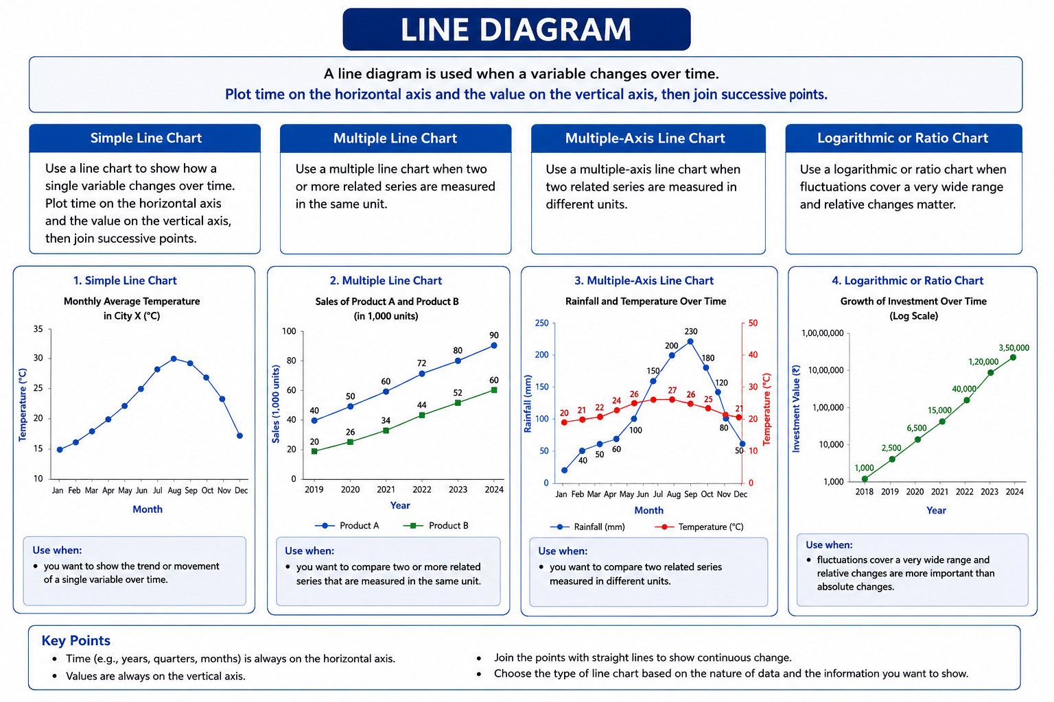
Use a line diagram when a variable changes over time. Plot time on the horizontal axis and the value on the vertical axis, then join successive points.
- Multiple line chart: two or more related series measured in the same unit.
- Multiple-axis chart: related series measured in different units.
- Logarithmic or ratio chart: useful when fluctuations cover a very wide range and relative changes matter.
10.2 Bar Diagram
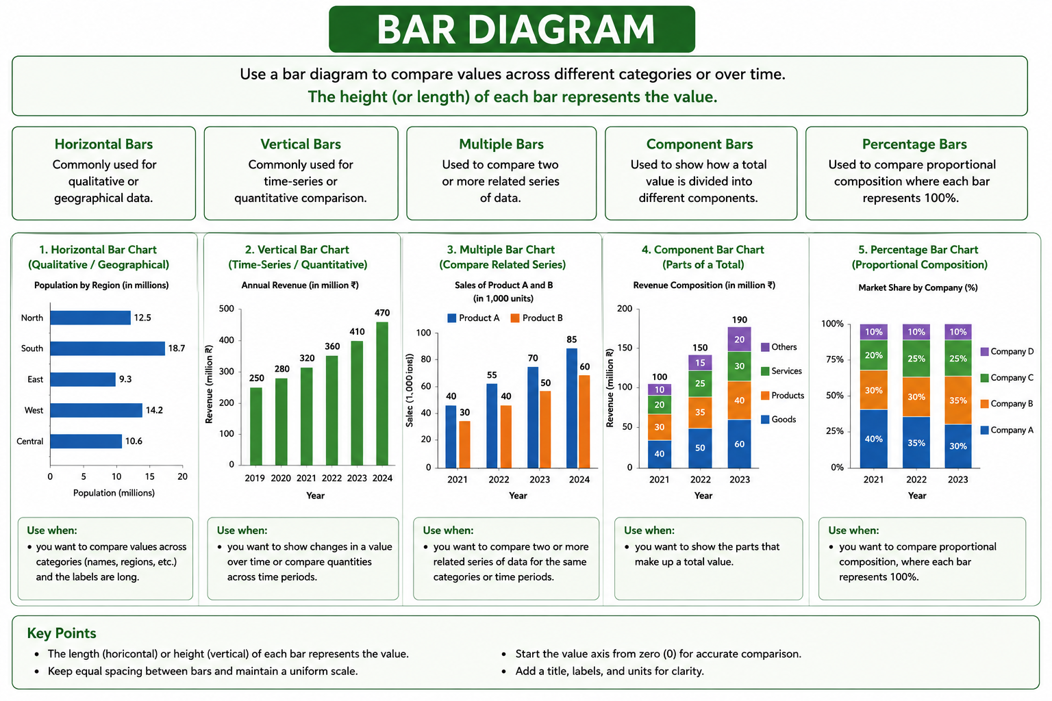
- Horizontal bars: commonly used for qualitative or geographical data.
- Vertical bars: commonly used for time-series or quantitative comparison.
- Multiple bars: compare two or more related series.
- Component bars: show parts of a total.
- Percentage bars: compare proportional composition where each bar represents 100%.
10.3 Pie Chart
A pie chart shows how a total is divided among components. Each sector’s angle is proportional to its share.

Mini Example
A company spends ₹80 lakh on materials out of total expenditure of ₹400 lakh.
10.4 ICAI Diagram Decoder
| Clue in the question | Correct diagram |
|---|---|
| Two or more related time series in the same unit | Multiple line chart |
| Related time series in different units | Multiple-axis line chart |
| Relative or percentage changes over a wide range | Ratio / logarithmic chart |
| Qualitative or spatial comparison | Horizontal bar diagram |
| Quantitative data or variation over time | Vertical bar diagram |
| Compare two or more related series | Multiple / grouped bar chart |
| Components and their relation to the total | Divided bar chart or pie chart |
11. Frequency Distribution
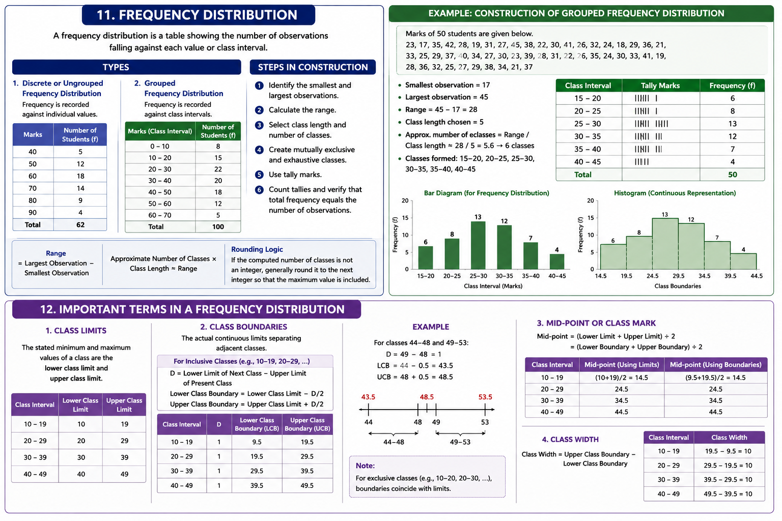
A frequency distribution is simply a systematic way of showing how many times each value, or each group of values, occurs.
Suppose a teacher has the marks of 30 students:
Looking at the list directly does not immediately tell us:
- which mark occurs most often,
- how many students scored below 25, or
- where most students are concentrated.
11.1 Meaning of Frequency
Frequency means the number of times a particular value occurs.
Simple Example
In the above marks, the value 24 appears four times.
11.2 Discrete or Ungrouped Frequency Distribution
When the number of different values is small, each value can be shown separately.
| Marks | Tally | Frequency |
|---|---|---|
| 18 | ||| | 3 |
| 19 | || | 2 |
| 20 | | | 1 |
| 21 | || | 2 |
| 22 | ||| | 3 |
| 23 | || | 2 |
| 24 | |||| | 4 |
| 25 | ||| | 3 |
| 26 | ||| | 3 |
| 27 | || | 2 |
| 28 | || | 2 |
| 29 | | | 1 |
| 30 | || | 2 |
| Total | 30 |
11.3 Grouped Frequency Distribution
If there are many observations spread over a wide range, listing every value separately makes the table too long. We then combine values into class intervals.
For example, suppose the marks of 50 students range from 17 to 45. Instead of showing every mark separately, we may create the following classes:
| Class Interval | Meaning | Frequency |
|---|---|---|
| 15–20 | Marks from 15 up to 20 | 6 |
| 20–25 | Marks from 20 up to 25 | 8 |
| 25–30 | Marks from 25 up to 30 | 13 |
| 30–35 | Marks from 30 up to 35 | 12 |
| 35–40 | Marks from 35 up to 40 | 7 |
| 40–45 | Marks from 40 up to 45 | 4 |
| Total | 50 |
Grouped: several nearby values are combined into one interval.
11.4 Steps in Constructing a Grouped Frequency Distribution
Consider the following marks:
Step 1: Identify the Smallest and Largest Observations
Largest Observation = 45
Step 2: Calculate the Range
Range = 45 − 17 = 28
The range tells us the total spread of the observations.
Step 3: Select a Suitable Class Length
Suppose we choose a class length of 5 marks.
Step 4: Calculate the Approximate Number of Classes
= 28 ÷ 5 = 5.6
Step 5: Form Mutually Exclusive and Exhaustive Classes
One possible set of classes is:
- Mutually exclusive: an observation should fall in only one class.
- Exhaustive: every observation must be covered by some class.
Step 6: Use Tally Marks
Read each observation and put one tally against the appropriate class. The fifth tally is normally drawn across the first four, making groups of five easy to count.
Step 7: Count the Tallies and Verify the Total
12. Important Terms in a Frequency Distribution
Class limits, class boundaries, mid-points and class width are connected, but they are not the same. The easiest way to understand them is to use one running example.
Consider the following classes:
12.1 Class Limits
Class limits are the values actually written in the frequency table.
Example: Class 10–19
Lower Class Limit = 10
Upper Class Limit = 19
| Class Interval | Lower Class Limit | Upper Class Limit |
|---|---|---|
| 10–19 | 10 | 19 |
| 20–29 | 20 | 29 |
| 30–39 | 30 | 39 |
| 40–49 | 40 | 49 |
12.2 Class Boundaries
Class boundaries are the actual continuous limits separating two adjacent classes.
In the inclusive classes 10–19 and 20–29, there appears to be a gap between 19 and 20. A measured value such as 19.6 would not fit neatly if we treated the written limits as exact continuous limits.
Therefore, we remove the gap by finding the boundaries.
For Classes 10–19 and 20–29
D/2 = 0.5
Subtract 0.5 from the lower limit and add 0.5 to the upper limit.
Class 20–29 becomes 19.5–29.5
| Class Interval | D | Lower Boundary | Upper Boundary |
|---|---|---|---|
| 10–19 | 1 | 9.5 | 19.5 |
| 20–29 | 1 | 19.5 | 29.5 |
| 30–39 | 1 | 29.5 | 39.5 |
| 40–49 | 1 | 39.5 | 49.5 |
Another Example: Classes 44–48 and 49–53
D/2 = 0.5
Upper Boundary of 44–48 = 48 + 0.5 = 48.5
Therefore, the actual class boundary is 43.5–48.5. The next class becomes 48.5–53.5.
12.3 Mid-point or Class Mark
The mid-point is the central value of a class interval. It represents the entire class while drawing a frequency polygon or carrying out certain calculations.
Example: Class 10–19
The same answer is obtained from the boundaries:
| Class Interval | Mid-point Using Limits | Mid-point Using Boundaries |
|---|---|---|
| 10–19 | (10 + 19) ÷ 2 = 14.5 | (9.5 + 19.5) ÷ 2 = 14.5 |
| 20–29 | 24.5 | 24.5 |
| 30–39 | 34.5 | 34.5 |
| 40–49 | 44.5 | 44.5 |
12.4 Class Width
Class width tells us the size of the interval covered by one class.
Example: Boundary 9.5–19.5
| Class Interval | Boundaries | Class Width |
|---|---|---|
| 10–19 | 9.5–19.5 | 10 |
| 20–29 | 19.5–29.5 | 10 |
| 30–39 | 29.5–39.5 | 10 |
| 40–49 | 39.5–49.5 | 10 |
12.5 Quick Comparison
| Term | Meaning | Example for Class 10–19 |
|---|---|---|
| Lower Class Limit | First stated value | 10 |
| Upper Class Limit | Last stated value | 19 |
| Lower Class Boundary | Actual continuous lower limit | 9.5 |
| Upper Class Boundary | Actual continuous upper limit | 19.5 |
| Mid-point | Central value of the class | 14.5 |
| Class Width | Size of the interval | 10 |
13. Cumulative, Relative and Percentage Frequency
Ordinary frequency tells us how many observations are in one class. Cumulative frequency tells us how many are below or above a point. Relative and percentage frequencies show each class as a share of the total.
13.1 Less-than Cumulative Frequency: Count Upwards
Add frequencies progressively from the first class downward. The values rise from zero towards total frequency.
13.2 More-than Cumulative Frequency: Count Downwards
Begin with total frequency and subtract class frequencies progressively. The values fall towards zero.
| Class | Frequency | Less-than CF | More-than CF |
|---|---|---|---|
| 0–10 | 3 | 3 | 12 |
| 10–20 | 4 | 7 | 9 |
| 20–30 | 5 | 12 | 5 |
13.3 Relative Frequency
13.4 Percentage Frequency
13.5 Frequency Density
13.6 ICAI-Style Cumulative Frequency Calculations
Example 1: “More than 30” from less-than cumulative data
Below 10 = 15, Below 20 = 38, Below 30 = 65, Below 40 = 84 and Below 50 = 100.
Answer: 35 students.
Example 2: Observations between 250 and 300
More than 250 = 38 and More than 300 = 15.
Answer: 23 observations.
14. Histogram
A histogram is used for continuous grouped data. Its rectangles touch each other because the classes are continuous. The area of each rectangle should represent the frequency.
A histogram represents a continuous frequency distribution through adjacent rectangles.
- The horizontal axis carries class boundaries.
- The vertical axis carries frequency when class widths are equal.
- When class widths are unequal, use frequency density.
- There are no gaps between adjacent rectangles.
| Bar Diagram | Histogram |
|---|---|
| May have gaps between bars | Rectangles are adjacent |
| Used for discrete or categorical comparison | Used for continuous grouped data |
| Width usually has no numerical meaning | Width represents class interval |
| Height represents magnitude | Area represents frequency; height may represent density |
15. Frequency Polygon
A frequency polygon is made by plotting class mid-points against frequencies and joining the points. It is useful for comparing two or more distributions on the same graph.
A frequency polygon is drawn by plotting class mid-points against corresponding frequencies and joining successive points with straight lines.
- Calculate class mid-points.
- Plot each pair: (mid-point, frequency).
- Join the points.
- Add one imaginary class at each end with zero frequency to close the polygon.
16. Ogives or Cumulative Frequency Curves
Ogives are cumulative frequency curves. They help us find how many observations are below or above a value and also help locate the median and quartiles.
An ogive is obtained by plotting cumulative frequency against class boundaries.
16.1 Less-than Ogive
- Plot upper class boundaries on the horizontal axis.
- Plot less-than cumulative frequencies on the vertical axis.
- The curve generally rises from left to right.
16.2 More-than Ogive
- Plot lower class boundaries on the horizontal axis.
- Plot more-than cumulative frequencies on the vertical axis.
- The curve generally falls from left to right.
16.3 Graphical Quartiles
- The intersection of less-than and more-than ogives gives the median.
- Quartiles can also be located using cumulative frequency positions.
17. Frequency Curves
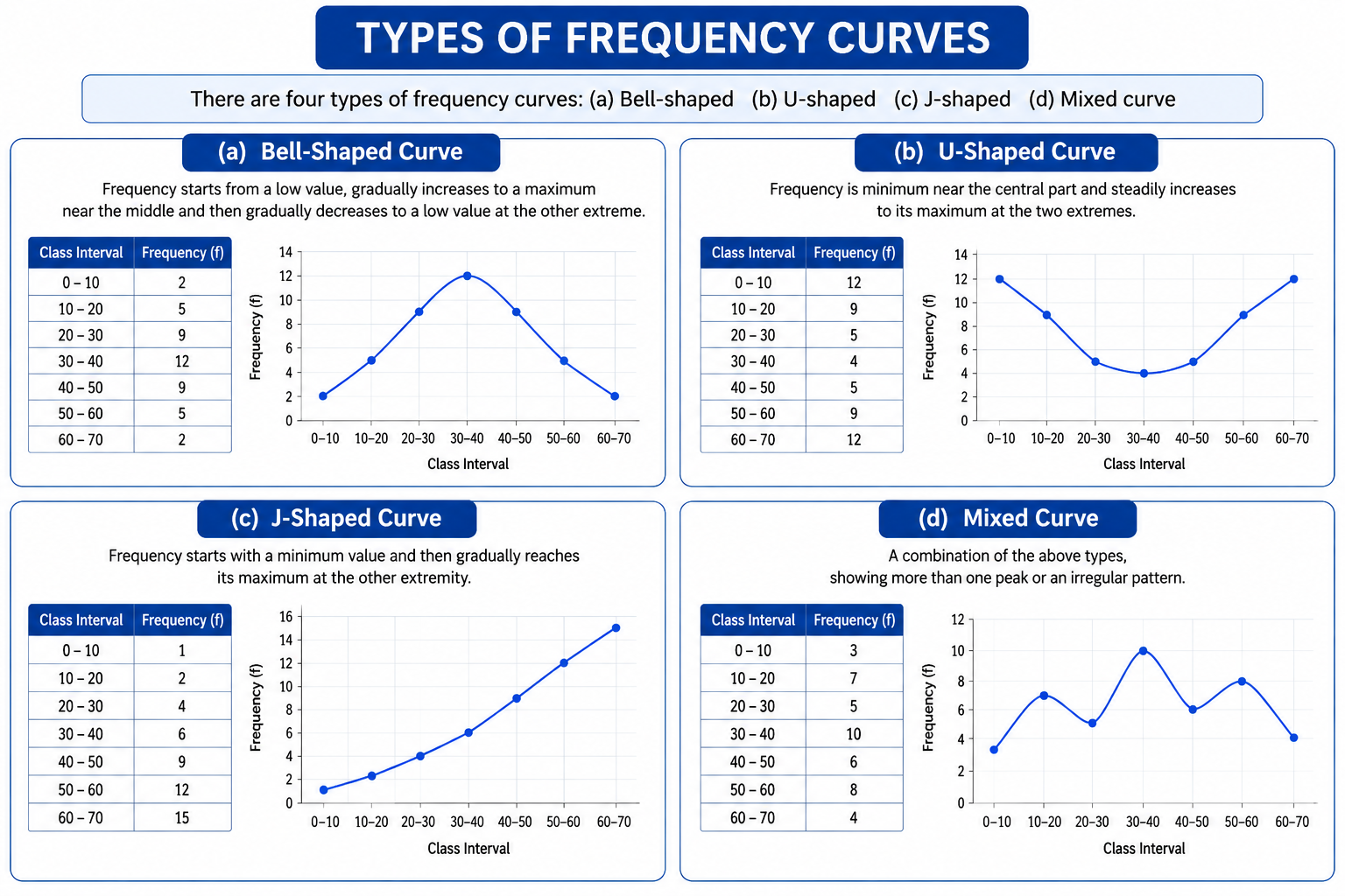
A frequency curve shows the overall shape of the distribution. It tells us whether most observations are near the centre, near the ends or mainly on one side.
A frequency curve is a smooth curve representing the general shape of a distribution. It may be treated as a smooth limiting form of a histogram or frequency polygon.
| Shape | Pattern | Typical Interpretation |
|---|---|---|
| Bell-shaped | Low at both ends, highest near the centre | Many natural characteristics such as height or marks |
| U-shaped | High at both ends, low in the middle | Two extreme groups dominate |
| J-shaped | Starts low and rises strongly towards one end | Frequency accumulates towards one extreme |
| Mixed | Combination of shapes | More complex population structure |
18. Decision Guide: Which Method Should You Use?
| Question Requirement | Best Method | Reason |
|---|---|---|
| Show movement over years | Line diagram | Emphasises trend over time |
| Compare categories | Bar diagram | Direct visual comparison |
| Show components of one total | Pie chart or component bar | Shows composition |
| Summarise repeated values | Frequency distribution | Shows occurrence count |
| Represent continuous grouped data | Histogram | Area represents frequency |
| Compare distribution shapes | Frequency polygon | Multiple polygons can share one graph |
| Find median or quartiles graphically | Ogive | Uses cumulative frequencies |
| Exact detailed figures required | Table | More precise than a diagram |
19. Integrated Worked Example
The weights of 20 components, in kilograms, are:
19.1 Find the Range
19.2 Form Classes of Width 5
Suitable inclusive classes are 44–48, 49–53, 54–58, 59–63, 64–68 and 69–73.
| Class | Frequency | Class Boundaries | Mid-point | Less-than CF |
|---|---|---|---|---|
| 44–48 | 2 | 43.5–48.5 | 46 | 2 |
| 49–53 | 2 | 48.5–53.5 | 51 | 4 |
| 54–58 | 4 | 53.5–58.5 | 56 | 8 |
| 59–63 | 4 | 58.5–63.5 | 61 | 12 |
| 64–68 | 4 | 63.5–68.5 | 66 | 16 |
| 69–73 | 4 | 68.5–73.5 | 71 | 20 |
20. ICAI MCQ and Calculation Decoder
This section converts the recurring ICAI question patterns into direct decision rules. Use it after studying the detailed explanations, not as a substitute for understanding them.
20.1 One-Word MCQ Triggers
| ICAI clue | Answer | Reason |
|---|---|---|
| Numerical facts | Statistics in plural sense | Refers to data or figures |
| Science or method | Statistics in singular sense | Refers to the discipline |
| Qualitative characteristic | Attribute | Described, not measured |
| Counted values | Discrete variable | Separate whole-number values |
| Measured values | Continuous variable | Any value within an interval |
| Government census report used by a student | Secondary data | Already collected by another agency |
| Height recorded with measuring tape | Primary and continuous data | First-hand measurement of a continuous variable |
| Exact figures | Tabular presentation | Most accurate mode |
| Most attractive | Diagrammatic presentation | Easy visual communication |
| Hidden trend | Diagrammatic presentation | Pattern becomes visually noticeable |
| Mode graphically | Histogram | Modal class is shown by tallest rectangle |
| Median graphically | Ogive | Located from cumulative frequency |
20.2 Formula and Range Recall
| Concept | Formula / Rule | Meaning of symbols |
|---|---|---|
| Pie-chart angle | (Component ÷ Total) × 360° | Component = one part; Total = sum of all parts |
| Class mid-point | (Lower limit + Upper limit) ÷ 2 | Central value of the class |
| Class length | UCB − LCB | UCB = upper class boundary; LCB = lower class boundary |
| Relative frequency | f ÷ N | f = class frequency; N = total frequency |
| Frequency density | f ÷ class length | Used for unequal class widths |
| Less-than and more-than CF at same boundary | Add to N | N = total frequency |
20.3 Fully Solved ICAI-Style Examples
Example A: Pie-Chart Angle Difference
Cost components are 12, 20, 35 and 23 units. Find the difference between the central angles of the largest and smallest components.
Answer: 92°.
Example B: Number of Cases up to a Value
Accidents 0, 1, 2, 3, 4, 5, 6 have frequencies 15, 19, 22, 31, 9, 3, 2. Find the cases when 3 or fewer accidents occurred.
Answer: 87 cases.
Example C: Percentage Earning Above a Limit
Income classes 500–999, 1000–1499, 1500–1999 and 2000–2499 contain 15, 28, 36 and 7 persons respectively. Find the percentage earning ₹1,500 or more.
Answer: 50%.
Example D: Two-Way Classification Logic
Out of 1,000 persons, 25% are industrial workers and the rest agricultural workers. Three hundred watched the World Cup. Of the 700 who did not watch, 30% were industrial workers. Find agricultural workers who watched.
Answer: 260 persons.
21. Statistical Description of Data — Memory Map
- Plural: numerical facts or figures.
- Singular: science and method.
- Collect → classify → present → analyse → interpret.
- Used in economics, business, industry and government.
- Helps comparison, planning, forecasting and control.
- Studies aggregates and supports—not replaces—judgement.
- Discrete: counted values.
- Continuous: measured values.
- Attribute: qualitative description or category.
- Primary: collected first-hand for the present enquiry.
- Secondary: already collected and reused.
- The same data may be primary for one user and secondary for another.
- Personal, indirect or telephone interview.
- Mailed questionnaire or enumerator schedule.
- Observation and measurement for objective facts.
- Check accuracy, completeness and consistency.
- Classification may be chronological, geographical, qualitative or quantitative.
- Good classification makes comparison possible.
- Text: small amount of information.
- Table: exact and detailed figures.
- Diagram: quick visual comparison or pattern.
- Line: movement or trend over time.
- Bar: comparison between categories.
- Pie: components of one total.
- Frequency = number of occurrences.
- Ungrouped: each value shown separately.
- Grouped: nearby values combined into class intervals.
- Find smallest value, largest value and range.
- Select class width and number of classes.
- Classes must be mutually exclusive and exhaustive.
- Use tallies and verify total frequency.
- Limits: stated values.
- Boundaries: actual continuous limits.
- Mid-point: (lower + upper) ÷ 2.
- Width: upper boundary − lower boundary.
- Less-than CF accumulates upwards.
- More-than CF accumulates downwards.
- Relative frequency = f ÷ N.
- Frequency density = f ÷ class width.
- Continuous grouped data.
- Rectangles are adjacent.
- Area represents frequency.
- Unequal widths require frequency density.
- Plot class mid-points against frequencies.
- Join successive points with straight lines.
- Useful for comparing distribution shapes.
- Ogives use class boundaries and cumulative frequency.
- Less-than rises; more-than falls.
- Their intersection gives the median.
- Frequency curves reveal the distribution’s overall shape.